Liverpool Sound and Vision Rating * * * *
How you convey the meaning of a word is important, equally just as significant is the way it appears in the body of a text, in the application of pen to paper, or in the semi glow of the computer screen; the misuse of a line full of capital letters can lead to distress to the modern eye, confrontational, hostile, it may have been unintentional, a slip of the fingers and then not bothering to change because the sender knew what it meant…but to the recipient it feels as if they are put in the eye of someone else’s storm, and the defence mechanism kicks in.
The way we write a sentence is as important as the way we say it, and whilst there could be other ways to communicate, the modern approach used by some harking back to a time of hieroglyphs is perhaps a simpler way of expressing feelings, but it doesn’t have the same attachment as the beauty of a poem placed down with careful consideration in the perfect typeface or written serif.
The history of writing is intertwined with the art of typography, without one you arguably cannot have the other, a written rule perhaps that we adhere to, even in our jotted notes we consciously choose the style as well as the words to get our point across.
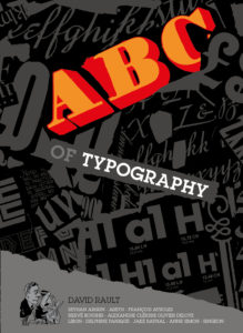
It is with justification of the choice and the fervent movement that proceeded humanity’s interaction with the form that David Rault’s ABC of Typography opens up before the reader; a different type of graphic novel but one that hits home just how we as consumers of the written word co-operate with the format as well as the sentence.
Published by SelfMadeHero, the graphic novel is true to its word, it examines, as well as illustrates, humanity’s relationship with the evolving genre, from the symbolic pictographs of thousands of years ago through to the explosion of typeface and the mathematical precision to which imagination took hold of the quest for the perfect connection between word and meaning.
This representation of form is highlighted by artists such as Aseyn Francois Ayroles, Oliver Deloye, Delphine Panique and Anne Simon, their own fascination with graphics adding an extra dimension to the words and thought-provoking words set down by typography expert David Rault.
History is about recording the moment, how we portray it is not only by the meaning of the word but how it appears on the page or screen, David Rault’s ABC of Typography is not just about information and passing on of fact, it is the reminder that humanity can place down the remarkable and keep it evolving, whilst at all times seeing beauty and dimension reflect the civilisation of the time.
David Rault’s ABC of Typography is released on September 12th via SelfMadeHero.
Ian D. Hall
